

FILM TITLES
01.
02.
The sequence opens on a bright marquee sign with clean type, until a green ray-gun blast throws it into chaos—darkening the scene, warping the title into disarray, and collapsing the sign.
DEVELOPMENT
+PASSES & EXECUTION


RESEARCH
Thirty years after the original attack, the Killer Klowns return to Kismet, where two stranded circus performers and survivor Mike Tobacco must fight them while being blamed for the chaos. Directed by Stephen Chiodo and produced by Ryan Gosling, the film combines horror with absurd comedy, catering to cult fans, nostalgic audiences, and viewers drawn to retro, midnight-movie spectacle.


03.
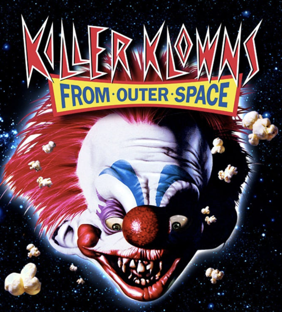
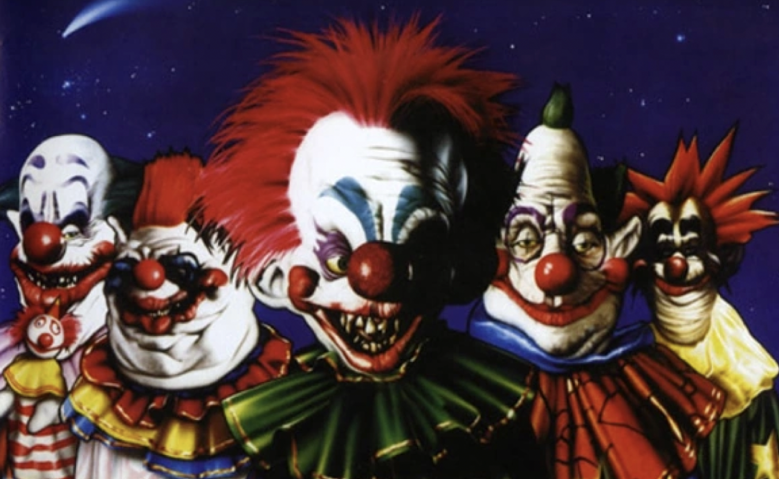
KILLER KLOWNS
The Killer Klowns brand uses a jagged wordmark, with “FROM OUTER SPACE” on a yellow carnival-style ribbon. Iconic motifs include cotton candy cocoons, rayguns, popcorn, circus tent UFOs, balloon animals, and grotesque clown sculpts. Its palette is loud and candy-colored—reds, pinks, yellows, and blues contrasted with black or inky purples. The tone is deliberately ridiculous and rooted in ’80s cult horror.
IDEATION
Both concepts aim to capture a playful yet sinister aura, blending campy humor with sudden horror to keep audiences off balance. The intent is to shock, amuse, and set the tone for a chaotic, cult-style experience.
04.
DEVELOPMENT
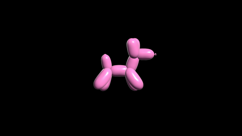
The balloon dog took a good amount of experimenting. In the original pitch, the dog was meant to be cel animated, but the look wasn’t quite right, and both my director and I agreed that utilizing a model would be more appealing.
Much like the balloon dog, the title also took multiple tries and experimentation to rein in. My first attempt connected strongly to the franchise colors rather than its typeface, which proved to fall out of line with the original title feel. I wanted to re-vamp the title without completely rebranding the movie and changing the emotions the original conveyed.
I moved on to tie the color down to make room for a more interesting font choice and treatment. I carried along the idea of creating a banner like the original logo to hold some secondary type, but my director and I agreed to scrap it moving forward.


CONCEPT 1

TITLE DEVELOPMENT
Finally, I ended by circling back to the original killer klowns typeface, deciding what isn’t broken does not need fixing, keeping the secondary text similar to previous passes. I chose to add a glow and roughness to the type to keep it fresh and fun, mimicking neon carnival signs.
06.
ANIMATION
1ST PASS

I began with a yellow, saturated, cel-animated balloon dog against a deep maroon background. I quickly decided that for my next pass, there were much easier ways to execute the dog’s movement that didn’t require so much legwork.
2ND PASS

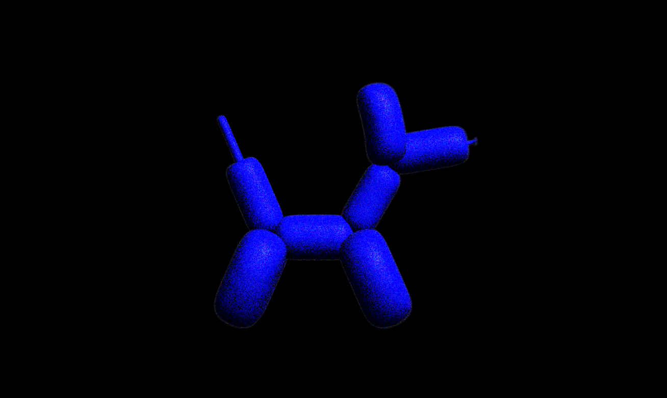
I then adjusted the colors to align with the studio's previous style, while maintaining the combination's improved and fresh appearance. I also swapped to a 3D model in After Effects, which had replaced the cel animation well.
FINAL PASS
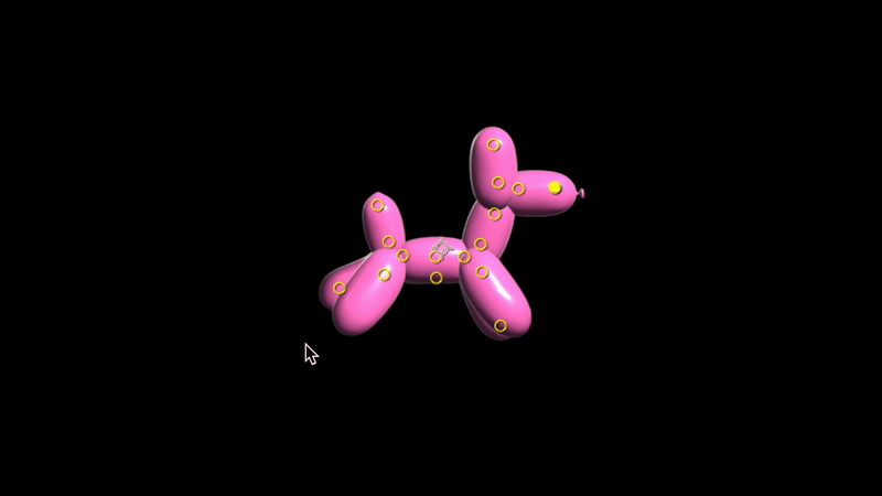

Lastly, I swapped out the model for one with disconnected limbs so it would be easier to puppet and to achieve a much more accurate quad movement. Most of the sequence itself remains the same, with the title being the most notable change, with the Killer Klowns type animation dominating the secondary elements.
REVISIONS

Next, I tweaked the model’s movement to be more fluid, as well as the way he blew up and expanded. The secondary title text animation flickers on instead of sliding into place like in the previous pass, making for a more appealing look, yet still not quite right.

Balloon dog Cartoon & Grain
Blood splatter footage
07.
EXECUTION
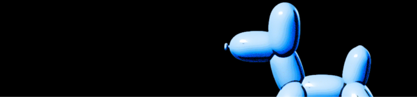
For my final result, I used a 3D model of a balloon dog that I took into After Effects. I used the puppet pins to manipulate its limbs, seeking an opportunity to use the tool, and offset the legs to achieve a proper quad movement.
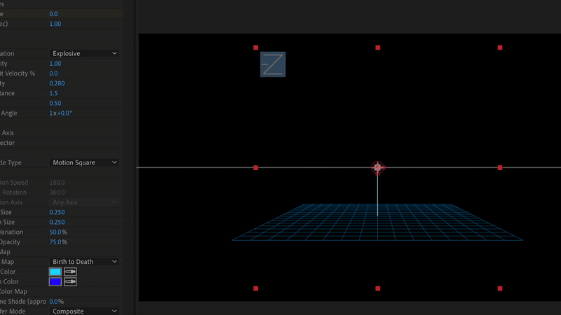
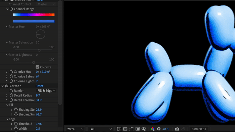
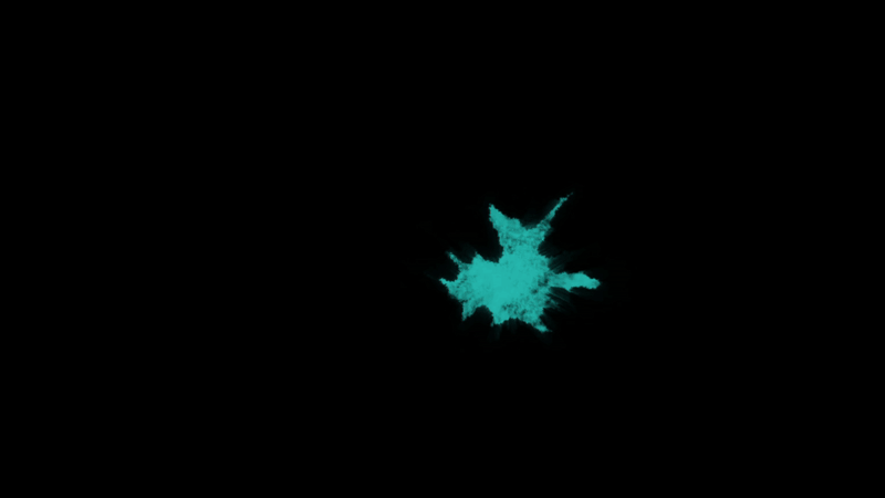
Additionally, I also used an array of effects to achieve the desired look. I used CC Particle World to create the confetti burst, and a glow and roughen on the title. I then used the cartoon and grain effects to give the balloon dog less of a 3D look, leaning more into a cartoon-like render. Finally, I color-corrected and used blood splatter footage behind the type, blending it into the background.
Confetti using CC Particle World.
CONCEPT 2
This concept uses the silly balloon bloodhound character to mislead viewers—bounding playfully until it swells, pops, and reveals the title in a splatter of blood.
The 3D model would prove to be much more appealing and overall better to work with. This also delivered more of a Killer Klowns feel than before, as the franchise’s design is more real-life and 3D leaning rather than having a flat animated look.

PROJECT BRIEF
OBJECTIVE: To create a logo title lock-up for The Return of Killer Klowns from Outer Space in 3d. This animation will be used for trailers in the theater, online, and on TV.
TAKEAWAY: The title lock-up should capture the outrageous terror of the Killer Klowns with the outcome being a polished, cinematic revival. It needs to spark nostalgia for longtime fans and thrill new viewers with a sense of bizarre, fun, and chaotic energy.
DELIVERABLES:
-Theatrical Release -designed for 2.40:1 aspect ratio
-6:9 HD format for home streaming
-Must have sound design/audio